
Qwen Image 3 Chinese Text Test
Qwen Image 3 can produce useful Chinese display text, but small copy still needs visual proofreading before publication.
Test goal
Inspect hierarchy and legibility across a Chinese poster, menu-style rows, packaging copy, a large headline and smaller supporting text.
Settings
Qwen Image 3 · portrait 4:3 · prompt expansion on · one output
Prompt
Vertical tea poster. Exact headline “春山新茶”. Subheading “明前龙井 · 清香回甘”. Add three short menu rows with aligned prices. Rice-paper texture, restrained ink landscape, no extra text.
Observed result
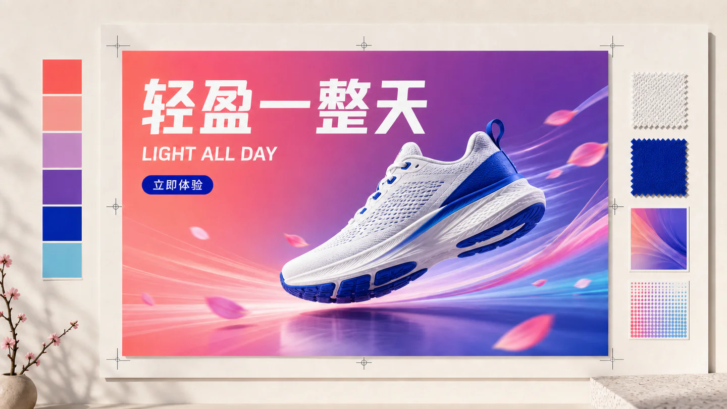
The headline has the clearest hierarchy. Smaller repeated characters and price alignment are the areas that require the closest review.
What worked
- Clear large headline
- Useful poster hierarchy
- Coherent image and type styling
What failed or needs review
- Small characters can deform
- Dense menu rows may lose alignment
- Generated copy must not be treated as final artwork
Improved prompt
Keep only the exact supplied Chinese strings. Use no decorative pseudo-text. Set every menu item on a separate baseline with wide spacing and large type.
Conclusion
Use the model for concept and display typography, then inspect every character at full size and replace critical body copy in a design tool when needed.